Kinematics: Partner: Ean Scanameo
How Object Moved:
The object in the video had moved up and down, with the object having a shorter height with each period.
The object in the video had moved up and down, with the object having a shorter height with each period.
Position vs Time Graph
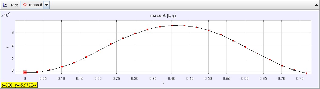
The graph shows that over time, the position of the graph increased as the mass increased in height, and slowly decreased when the mass decreased in height, giving a smooth curve that is hill shaped.
Velocity vs Time Graph
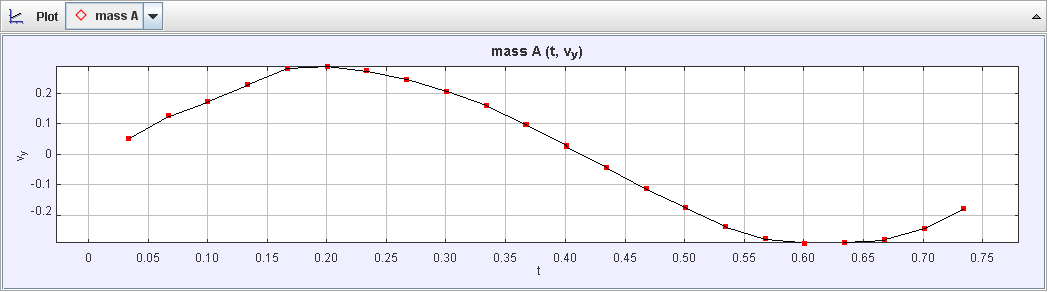
The graph shows that over time, the velocity was at its highest point when the mass was traveling upwards, had no velocity at the equilibrium point, and the velocity was at its lowest point when traveling downwards.
Acceleration vs Time Graph
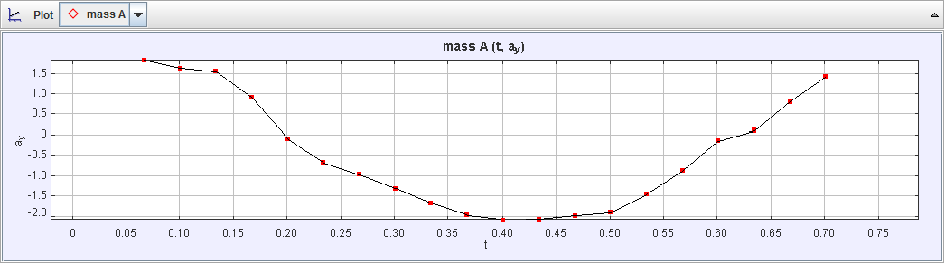
The graph shows that over time, the acceleration of the mass decreased over time while traveling downwards, was at its lowest point when the mass was at equilibrium, and increased when the mass was traveling upwards.
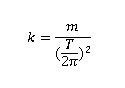
Spring Constant:
The measure of the elasticity of the spring. The higher the value of the spring constant, the more force needed to extend the spring.
Equation:
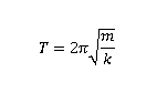
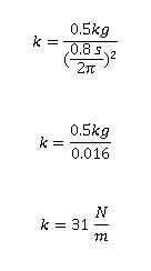
Rearranged Equation:
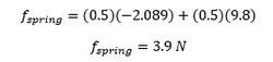
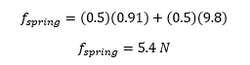
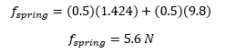
With Plugged in Numbers & Answer:
Forces:
Free-Body Diagram

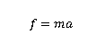
Newton's Second Law of Motion for Each Diagram
Original Equation:
Rearranged Equation:
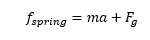
Top Free-Body Diagram Equation:
Equilibrium Free-Body Equation:
Bottom Free-Body Equation:
Force vs. Time Graph
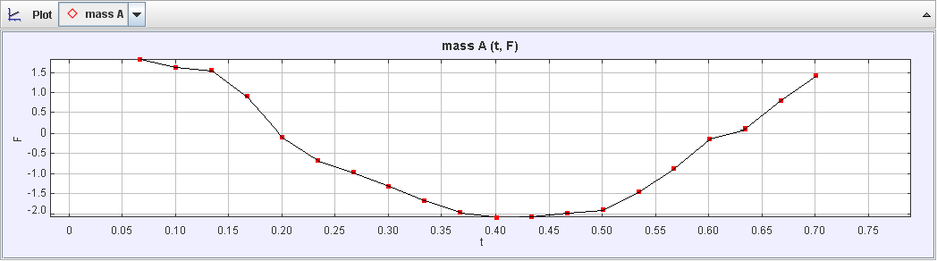
This force vs. time graph is displaying the forces acting on the 0.5kg weight during a time of one period. The first part of the graph shows that the mass dips during the first half of the graph since the force decreases over time till it becomes negative and the mass starts to rise because value of the force becomes positive in the second half of the graph.
Energy:
Kinetic Energy vs. Time (Total Motion) Graph
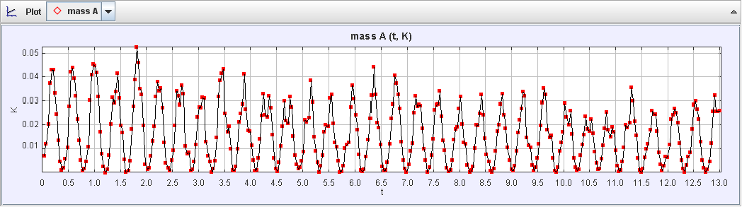
The graph shows a sharp-curved pattern, showing that when the mass was nearing the top, the kinetic energy graph would sharply rise, but when reaching equilibrium, would make the kinetic energy graph sharply decrease and then making the kinetic energy equal zero, and then when the mass would travel to the bottom, the kinetic energy would sharply rise, but when reaching equilibrium after, would make the kinetic energy graph sharply go down and equal zero. The gradual decrease that shows in the graph comes from the decrease in the amount of kinetic energy present with each oscillation period.
Kinetic vs. Time (One Period) Graph
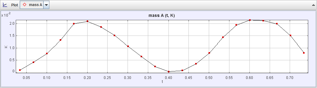
The graph shows that when the mass is going in the direction of up, the kinetic energy is the highest, there is no kinetic energy at the highest point, which is equilibrium point, but the kinetic energy of the mass was transferred to the spring, and when going down has kinetic energy present.
Gravitational Potential Energy vs. Time Graph
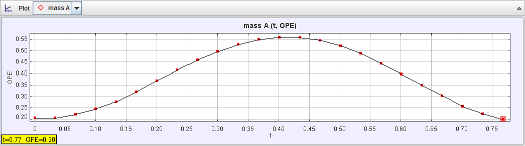
The graph shows that as the mass was going to the top, the gravitational potential energy slowly increased until the mass was in equilibrium, where it had the highest gravitational potential energy until it was pulled down to the bottom, where it slowly lost gravitational potential energy.
Total Mechanical Energy vs. Time Graph
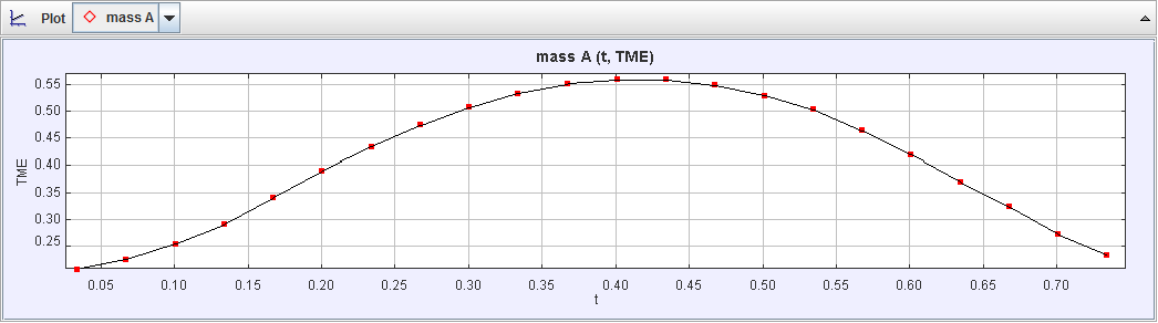
The graph tells us that the total mechanical energy steadily increased as it reached the top, where the mass reached the equilibrium point, and then slowly decreased as the mass was reaching the bottom. Even though energy was conserved, and the graph should look mostly flat, this graph is curved because kinetic energy is being taken into account.
